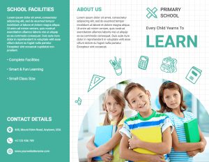
School Brochure Templates Guide And Example

Identify your audience. Every parent goes to great lengths to ensure that their child receives the best educational experience possible. As a result, school brochures are one of the most effective methods of disseminating information about both private and public schools. You may provide parents with a school brochure at any time to inform them about extracurricular institutions such as elementary schools, language schools, dancing schools, sports schools, or courses.
Everyone has the right to an education, and when creating a brochure, emphasize how a good education can prepare a person for his or her future and give him or her the best chance to effectively and independently overcome problems. The brochure templates provided here will help your school stand out from the crowd.
For first-year students, a brochure created with an online brochure maker is also a great resource. Acclimating to the new school culture should aid with information about the school maps to help students navigate the campus or organization. Our templates will help you create the perfect brochure for your organization.
What should a school brochure content include?
Include your school’s name and emblem, a picture of the school, and basic information such as the school address, phone number, and fax number on the front panel of the tri-fold brochure. You can also include class times and a website link. You can use a link hotspot, a QR link, or both in PhotoADKing.
A calendar of school dates and activities for the current school year can include on the back panel of a tri-fold brochure or the second page of a bi-fold brochure. Another good idea is to include contact information for key people such as the bursar or deputy heads.
Because the middle panel of a tri-fold brochure template is heavily reliant on graphics, you can use your own illustrations to show potential students your school and classes. You can put your school’s motto, goals, and objectives on the left side of the brochure template, and the history of your school or the opportunities it offers on the right side. These are, of course, just assumptions. Other users may prefer a map, teacher biographies, or examples of student success in their tri-fold brochure template.
Designing a school brochure – helpful hints for everyone
Remember that one of the most important purposes of school brochures is to connect with students and parents. Depending on your school’s profile, you should identify significant differences between your potential customers, which should influence the design and content of your brochure.
It is critical to understand not only your audience but also the mission of your organization. The ideals, best qualities, and goals that guide your school should reflect in the design of your chosen brochure template. The language, graphics, style, and image quality used in your templates should reflect the central messages of education. A brochure that does not highlight your school’s capabilities is useless.
Because the purpose of a brochure is to pique people’s interest in your school, avoid pompous language and long paragraphs. The text in your trifold or bifold brochure must be easy to read in order for the reader to fully comprehend the content. Avoid specialized language in your brochures, even if you are working with scientists and experiment teachers.
This does not imply that your school brochure templates must be stiff and uninteresting. A high-quality tri-fold brochure template has a variety of aesthetic elements that complement the brand or elicit emotion. Don’t be afraid to use bold colors and patterns in your designs because school can be fun.
Tips for School Brochures
Identify your audience
Are you attempting to reach prospective students or their parents? It’s amazing how few educational brochures seem to consider this. When compared to colleges, K-12 schools may need to market to a different audience.
Even among institutions of the same level, there are some subtle differences in likely prospects that should inform your design and content.
Understand your brand
It is critical to understand not only your target audience but also the mission of your organization. Your educational brochures should design to reflect your school’s values, best qualities, and aspirations. The copy, images, layout, and stock quality in your brochures should all reflect what you want your brand to communicate. No matter how useful an educational brochure is, it will always be jarring if it does not adhere to the school’s brand in any of those areas.
Use straightforward language
Brochures may have a lot of white space, but that doesn’t mean fancy words and walls of text are a good idea. Check that the copy flows smoothly and is easy to read. This isn’t so much dumbing down as it is ensuring that whoever reads your brochures understands the information on them. Keep the complicated language for academics.
Use professionally taken photographs
A brochure with good photos can add a lot of excitement and dynamics. Unfortunately, many examples from educational institutions demonstrate a blatant lack of investment in this area, resulting in stale brochures that appear to offer nothing exceptional.
Yes, your phone has a good camera, but you wouldn’t want to use it to promote your school. There’s also a lot more to photography than just having nice gear. A good photographer can use any camera to capture images that enhance your institution’s brand, whereas the majority of us can only harm it. Avoid using stock photos and instead use photos of your own employees, students, and facilities, as stock photos can make your brand appear more generic. Invest in high-quality printing to ensure that your photographs and other visual designs are accurately reproduced.
Keep clutter to a minimum
This is not to say that educational brochures must be simple. What constitutes visual clutter will differ depending on the brand or look you’re going for. However, we’ve seen a lot of creative brochure designs that use visual elements that don’t follow the brand or add excitement. If this is the case with your design, think about whether each element is necessary.
Make an investment in high-quality printing
We can’t emphasize enough how important quality is for multi-fold prints like brochures, regardless of who you choose to do your printing. Some lower-quality printing services may be incapable of producing things we take for granted, such as crisp folds in any type of stock. Others may be unable to reproduce the colors and precise alignment required by your designs. They may also have fewer options for making tabs, perforations, trims, and other custom options.
School Brochure Templates Gallery
- Simple and Light school brochure

2. White and Opal school brochure

3. Greyies school brochure

4. Abstract school brochure

5. Simple and Minimalist school brochure

Conclusions
We discuss some important school brochure tips and guidelines to help your school stand out from the crowd, as well as share examples of classic and professional brochure templates.


